
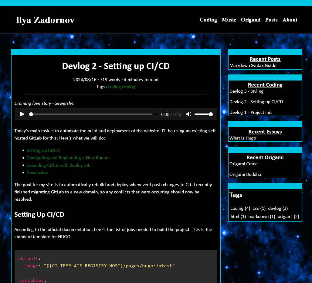
So, I think I don’t need a footer at all. Maybe I can move the RSS feed button to the sidebar section, but that’s for later. Now I’ll just delete it.
Clearing up
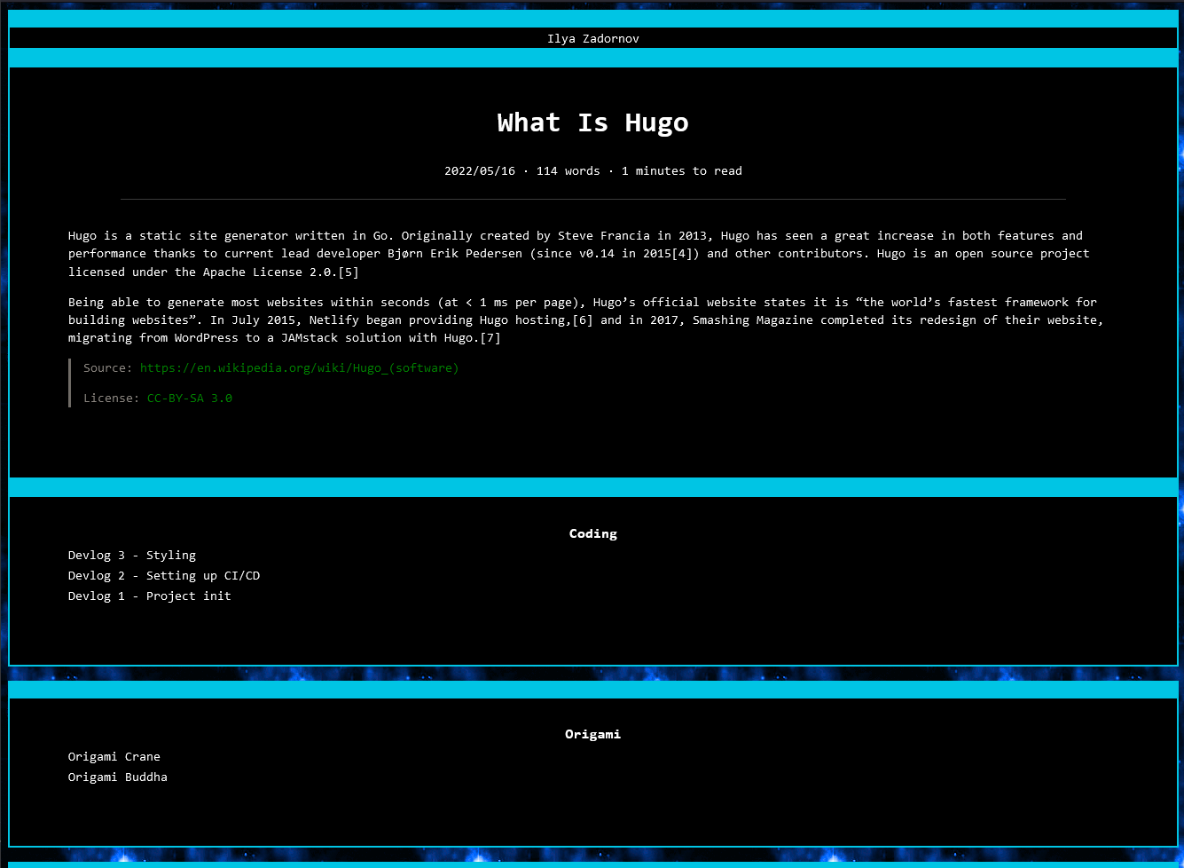
Now i need to figure out my basic layout. First of all. I’ll remove all layout styling from themes. Theme has a lot of media breaks. And a lot of strange styling.
Next I need to figure out my basic layout. First of all, I’ll remove all layout styling from the theme. The theme has a lot of media breakpoints and strange styling that I don’t like.
Layout
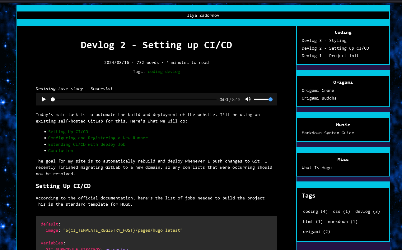
After that, I need to separate everything basically into 2 rows. The first row is for the header, and the second is for content and sidebar. Of course, this couldn’t go smoothly without CSS problems. I simplified all my layouts, but this thing is driving me crazy.
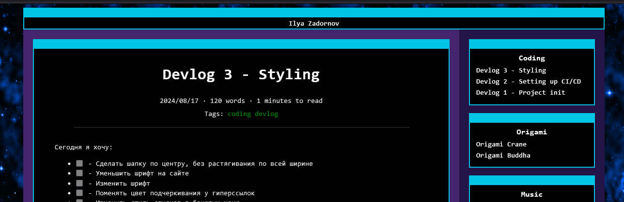
All posts are aligned okay. But this one…
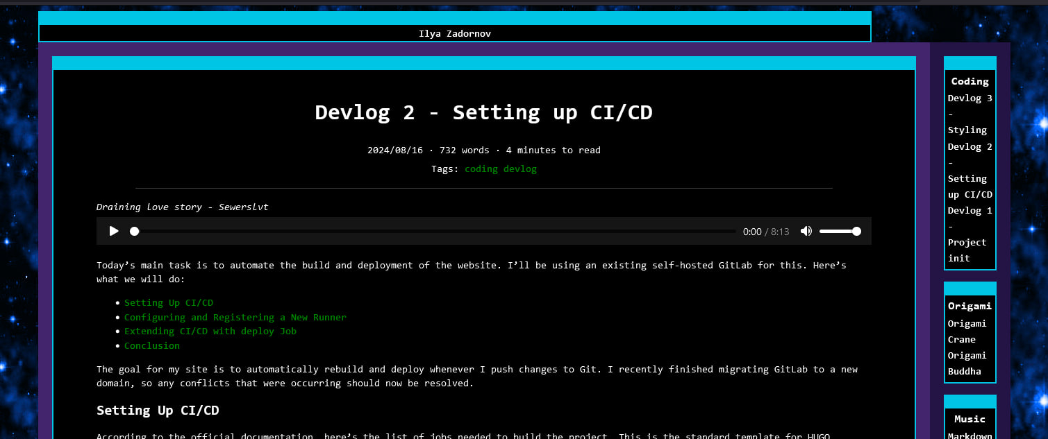
I tried everything until I figured out that this is comes from .content styling and the <pre> tag. After adding the code part below, everything aligned perfectly.
.content pre {
  overflow-x: auto;
  white-space: pre-wrap;
  word-wrap: break-word;
}
Expand code below if you want to see code for this.
My
baseof.html looks now like this<!DOCTYPE html>
<html>
<head>
{{ partial "head.html" . }}
</head>
<body>
<div class="container">
{{ partial "header.html" . }}
<div class="flex">
<main class="main">{{ block "main" . }}{{ end }}</main>
<aside class="right-sidebar">
<div class="side">
{{ range .Site.Sections }} {{ partial "side-recent.html" . }} {{ end
}} {{ partial "side-tags.html" . }}
</div>
</aside>
</div>
</div>
</body>
</html>
And here is my
layot.css* {
box-sizing: border-box;
}
/* the "container" is what wraps entire website */
.container {
max-width: 1200px;
margin: 0 auto;
}
/* this fixes issue with content overflow*/
.content pre {
overflow-x: auto;
white-space: pre-wrap;
word-wrap: break-word;
}
.header {
width: 100%;
}
.flex {
display: flex;
width: 100%;
}
aside {
width: 300px;
}
main {
flex: 1;
padding: 20px;
order: 2;
}
.right-sidebar {
order: 3;
}
@media only screen and (max-width: 800px) {
.flex {
flex-wrap: wrap;
}
aside {
width: 100%;
}
main {
order: 1;
}
.rightSidebar {
order: 3;
}
.navbar ul {
flex-wrap: wrap;
}
}
I use a violet background to help visualize the layout.
Let’s add some spacing
Next, I need to add spacing between my elements. It should be easy to do.
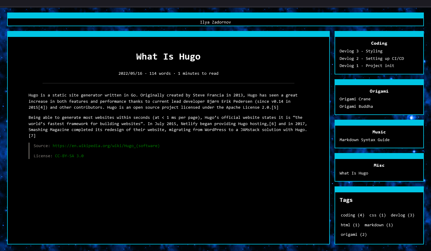
And now everything looks good!
Header
I don’t know how to make it look good or what to put there. For now, it’s just my name that should redirect you to the starting page. Let’s make the text a little bit bigger and fix the redirection.
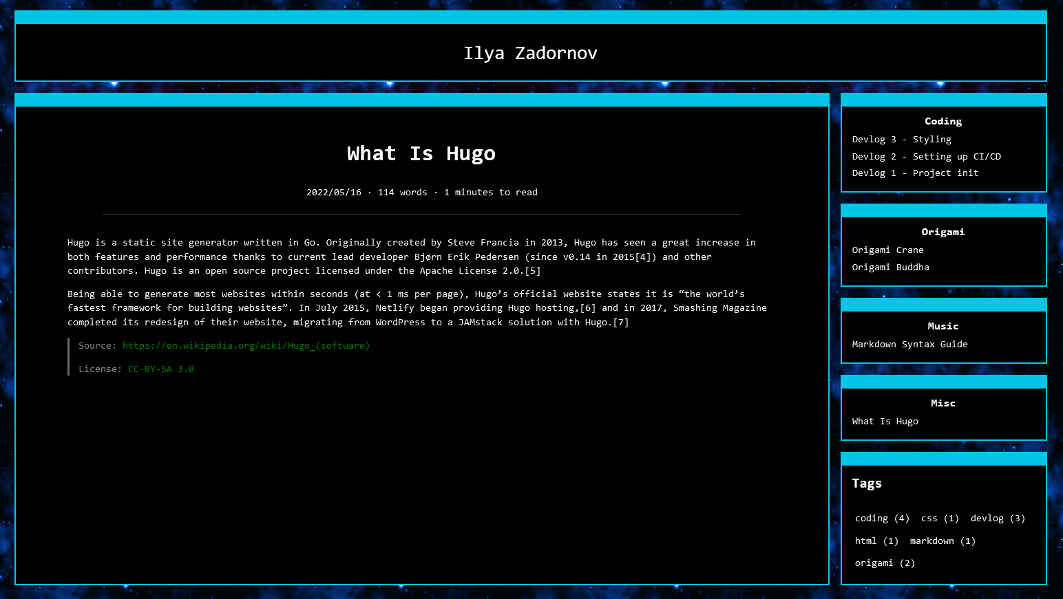
That’s all for today.
Bye! :V