
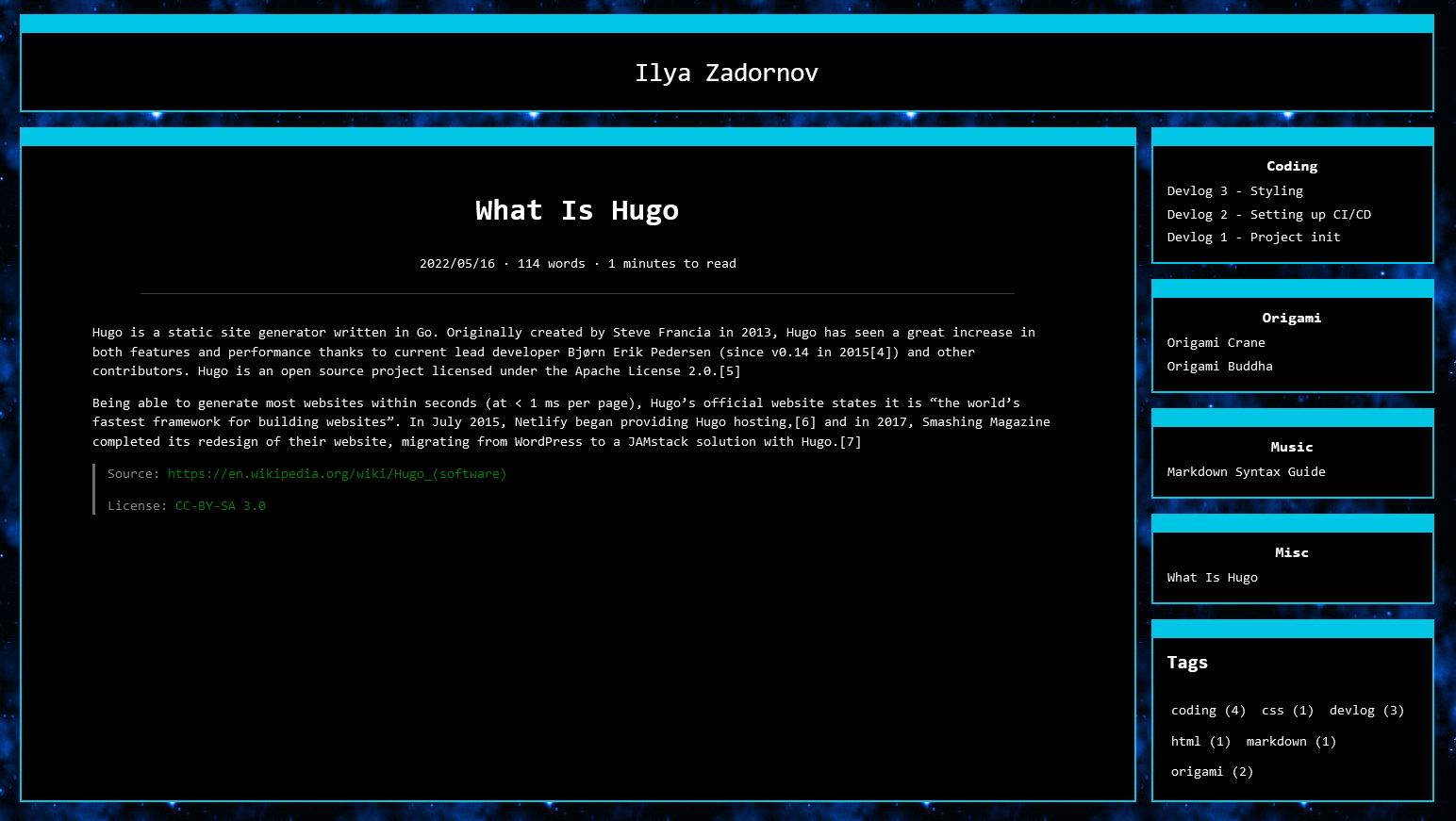
There’s not much today. My task for today is to create a gradient pixelized top for the border. Like the sadgirls one. Basicly the Idea comes from sadgirl.com. Take a look at this! Check this out! Her website Goblin-heart.
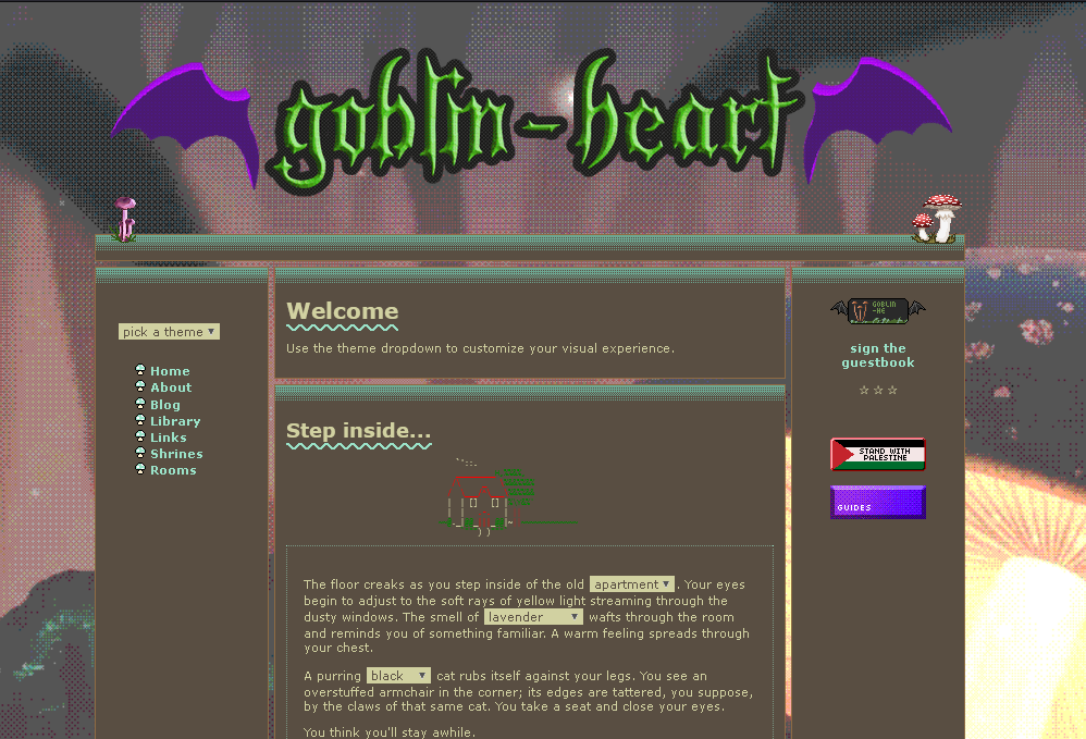
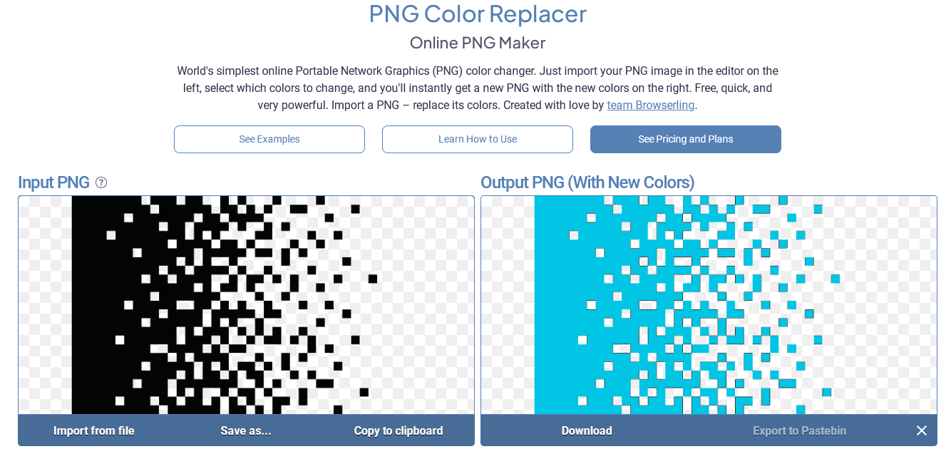
Cool! Right? I’d definitely want to have something similar on my website! So let’s make it. I took a simple pixel gradient of black and white. Then colored it using a simple online tool and adjusted its size.
Next i need to update my CSS and HTML. I made the border class which is resposible for borders.
Here is example of new ‘border’ wrapper
<div class="border">
  <div class="side-recent">
    <h3 class="decorated">
      <center>
        <a href="{{ .RelPermalink }}">{{ .Section | humanize }}</a>
      </center>
    </h3>
    <ul>
      {{ range first 5 .RegularPages.ByDate.Reverse }}
      <li style="margin: 0">
        <a href="{{ .RelPermalink }}">{{ .Title }}</a>
      </li>
      {{ end }}
    </ul>
  </div>
</div>
And here is new .border class
.main,
.side-recent,
.side-tags {
  position: relative;
  padding: 5%;
  padding-top: 0px;
}
.border {
  position: relative;
  border-style: solid;
  border-width: 1px 2px 2px 2px;
  border-color: #00c5e4;
  padding: 0%;
  padding-top: 20px;
  background: black;
}
.border::before {
  content: "";
  position: absolute;
  top: 0px; /* A little adjustments */
  width: 100%;
  height: 20px; /* Pixilize line height */
  background-image: url("/images/blue-gradient.png");
  background-size: 20px;
}

Perfect! I might look for a better gradient later, but for now, this works fine.
Have fun!
:>
