
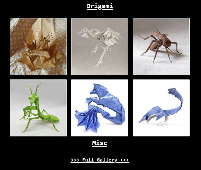
This time, I want to replace my generic HUGO homepage with a custom one. I deleted all the templates in index.html and started creating my own layout. The idea is to have a page with quick links and navigation to different parts of my website. The section for my Origami should be an image grid. This page should display the 5-6 latest posts in each section.
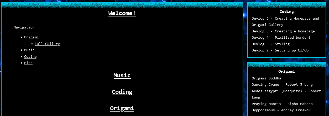
I’m still thinking about how to style the links and manage spacing. I’ll fix those off-screen. For now, it’s just a basic layout without any styling.
Origami section
To create a grid view for my Origami, I made some adjustments in my markdown template. I added a cover: tag to each Origami post and set the path to the cover image there. Now, the HTML code for the Origami section looks like this:
index.html<!-- ... -->
<h2 class="section__title">Origami</h2>
<div class="post-grid">
{{ $pages := .Site.GetPage "section" "origami" }} {{ $sortedPages :=
$pages.Pages | first 6 }} {{ range $sortedPages }}
<div class="post-card">
<a class="post-card__link" href="{{ .Permalink }}">
<div class="post-card__image-wrapper">
<img
class="post-card__image"
src="{{ .Params.cover }}"
alt="{{ .Title }}"
/>
</div>
</a>
</div>
{{ end }}
</div>
<!-- ... -->
section.css.section__title {
text-align: center;
margin-bottom: 20px;
font-size: 24px;
text-decoration: underline;
color: White;
}
.post-grid {
display: flex;
flex-wrap: wrap;
gap: 15px;
justify-content: center;
}
/* 3 items per row, accounting for gaps */
.post-card {
flex: 1 1 calc(33.333% - 20px);
max-width: calc(33.333% - 20px);
position: relative;
box-sizing: border-box;
}
/* This maintains a square aspect ratio */
.post-card__image-wrapper {
padding-top: 100%;
}
.post-card__image {
position: absolute;
border: 1px solid white;
top: 0;
left: 0;
width: 100%;
height: 100%;
object-fit: cover;
border-radius: 2px;
transition: transform 0.2s;
}
.post-card__image:hover {
transform: scale(1.05);
}
/* 2 items per row on medium screens */
@media (max-width: 968px) {
.post-card {
flex: 1 1 calc(50% - 20px);
max-width: calc(50% - 20px);
}
}
And yes, everything is responsive.
Orgiami Gallery
You see this Full Gallery link? Next, I need to create a full gallery for all my origami posts. I want to display it in two different layouts. How do you do that on a static site generated by HUGO? Well, it’s not as simple as I hoped…
The problem is everything on this site either single or list template. And there is no way to accsess query params from URL like ?layout=group or anything else. Belive me i tried everything.
All me have a content folder, sections and layouts. Of course you can use JS for this but this is not our way!
The problem is that everything on this site uses either a single or list template, and there’s no way to access query parameters from the URL, like ?layout=group or anything similar. Believe me, I tried everything. All I have is a content folder, sections, and layouts. Of course, you could use JS for this, but that’s not our way!
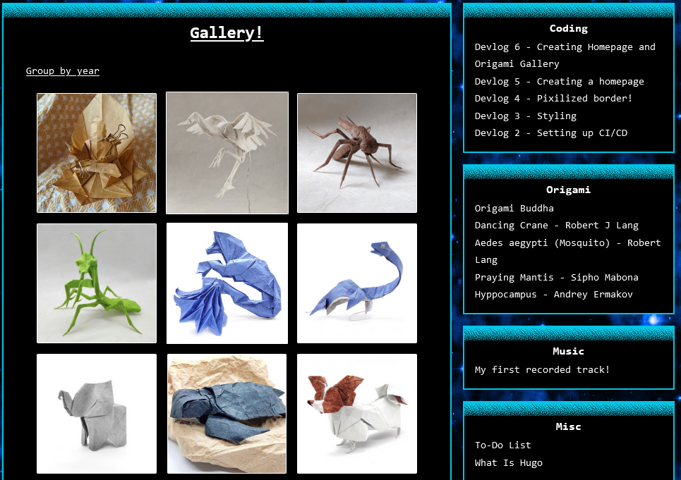
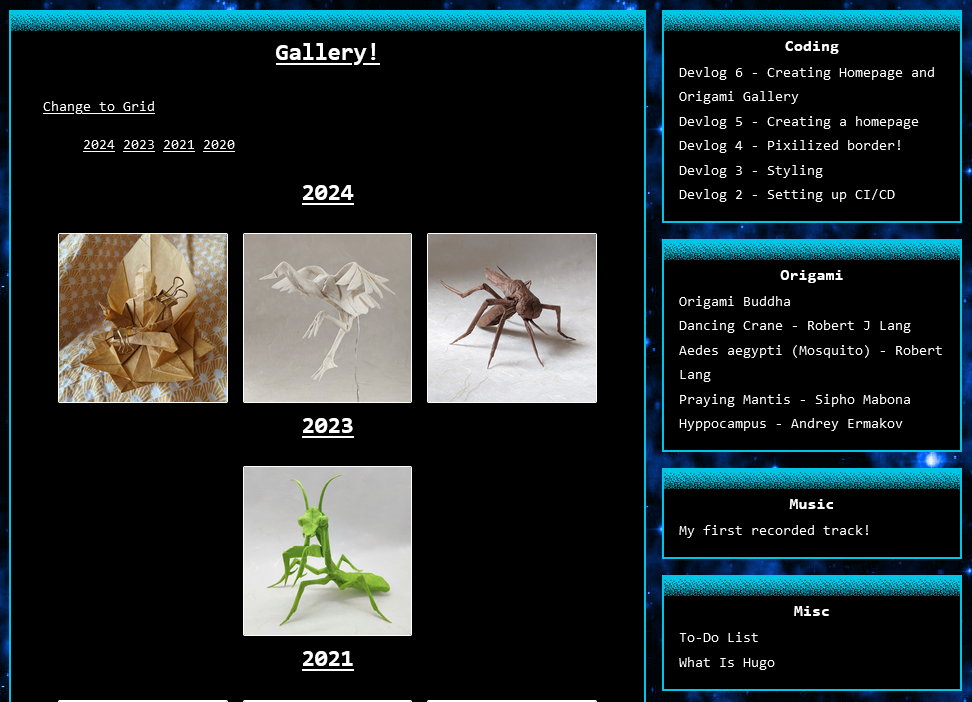
So, how did I actually do this? Well… I created a specific section called origami-grouped in my /content. And do not forget to create an boilerplate index.md in this folder. Otherwise, index.html for section will not be generated. This is needed for navigation. In my layouts folder, I created the following structure: basically, a specific list template for each section.
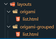
All we need now is to add a navigation link in our list. That’s the trick. Pseudo-dynamic added to static site! How this works? HUGO when generating is looking for a _default/list.html but if we have a layouts/<section>/list.html it will use it. HUGO automaticly generate a URL for each of our contens folder <domain>/<section>/<slug>. And based on URL it choses which layout to use and where to look for it. If therese is now dedicated layout specifed for section it will use layout from _default/list.html.
All we need now is to add a navigation link to our list. That’s the trick: pseudo-dynamic content added to a static site! How does this work? When HUGO generates the site, it looks for a _default/list.html, but if we have a layouts/<section>/list.html, it will use that instead. HUGO automatically generates a URL for each of our content folders as <domain>/<section>/<slug>. Based on the URL, it chooses which layout to use and where to look for it. If there’s no dedicated layout specified for a section, it will fallback to the layout from _default/list.html.
If you’re interested, here are the list layouts for each section.
layouts/orgiami/list.html{{ define "main" }}
<div class="max-wrapper">
<div class="section__header section--gap">
<h2 class="section__title">Gallery!</h2>
<a class="section__link" href="/origami-grouped/">Group by year</a>
</div>
<div class="post-grid">
{{ $pages := .Site.GetPage "section" "origami" }} {{ range $pages.Pages }}
<div class="post-card">
<a class="post-card__link" href="{{ .Permalink }}">
<div class="post-card__image-wrapper">
<img
class="post-card__image"
src="{{ .Params.cover }}"
alt="{{ .Title }}"
/>
</div>
</a>
</div>
{{ end }}
</div>
<h3 class="section__footer">
<a class="section__link" href="#"> Back to top </a>
</h3>
</div>
{{ end }}
layouts/orgiami-grouped/list.html{{ define "main" }}
<div class="max-wrapper">
<div class="section__header">
<h2 class="section__title">Gallery!</h2>
<a class="section__link" href="/origami/">Change to Grid</a>
</div>
<ul clsass="no-margin">
{{ $pages := .Site.GetPage "section" "origami" }} {{ range
$pages.Data.Pages.GroupByDate "2006" }}
<li class="section_li">
<a class="section__link" href="#{{ .Key }}">{{ .Key }}</a>
</li>
{{ end }}
</ul>
{{ $pages := .Site.GetPage "section" "origami" }} {{ range
$pages.Data.Pages.GroupByDate "2006" }}
<h3 class="section__title section__title--orgiami-group" id="{{ .Key }}">
{{ .Key }}
</h3>
<div class="post-grid">
{{ range .Pages }}
<div class="post-card">
<a class="post-card__link" href="{{ .Permalink }}">
<div class="post-card__image-wrapper">
<img
class="post-card__image"
src="{{ .Params.cover }}"
alt="{{ .Title }}"
/>
</div>
</a>
</div>
{{ end }}
</div>
{{ end }}
<h3 class="section__footer">
<a class="section__link" href="#"> Back to top </a>
</h3>
</div>
{{ end }}
