
I spent a couple of days working on my website’s design. The main goal was to make it more visually appealing and clean up the messy code. Here are all the changes I made.
Design Changes
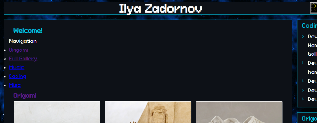
Started with changing how my sections look - added some new arrows that I think look pretty good. Also switched to a new font called PixeloidSans which feels much better than the old one.
For the main page, I decided to get rid of the old navigation completely. Now it’s just a clean grid with posts. Made some changes to the cards too. Now when you hover over them, you’ll see an overlay with the post name.


While browsing indie web stuff, I found this really cool space background idea here. I liked it so much I made something similar for my site.
Code Updates
After removing a bunch of weird CSS blocks I didn’t need anymore, a lot of things broke. So naturally, the next step was fixing all that broken CSS. At some point the posts had broken too (not sure when that happened), so I rewrote that CSS part as well. The code looks much cleaner now.
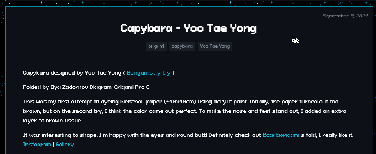
Completely changed how post headers look now:
- Moved the date to the top right corner
- Centered the title below it
- Put tags in the center under the title
- Made spacing between elements smaller to focus more on content
- Tags are now gray instead of bright blue, but still show feedback when you hover
Added a few more things:
- Oneko - a new little friend for the site
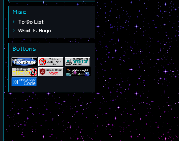
- Updated some buttons
- Fixed image centering in posts while keeping text left-aligned
- Added proper spacing for mobile view

After these couple of days of work, the site looks much better now!
><><><><><><><><><>
Keep folding!